
15 Minutes of Fame
Limited-edition can commemorates pop-art anniversary.
Design and history come full circle as Campbell Soup Company introduces limited-edition tomato soup cans to commemorate the 50th anniversary of Andy Warhol’s 1962 famed 32 Campbell’s Soup Cans. The condensed Tomato soup cans have labels with a nod to Warhol’s original artwork featuring shelf popping color combinations in orange and blue, and pink and teal.
Launched this fall, the limited-edition cans are available exclusively through Target locations nationwide and sell for $.75 per 10.75-oz. can, while supplies last. Deutsch Design Works (www.ddw.com) designed the stunningly vibrant labels to reflect Warhol’s pop-art style produced under license from The Andy Warhol Foundation, a not-for-profit corporation that promotes the visual arts. Steve Goldman, general manager of Deutsch Design Works, comments on the design as a, “fun project designers love to do.”
Ed Carolan, Campbell North America vice president and general manager, reflects on the decision to launch the limited-edition golden anniversary can: “Campbell’s Condensed soup is an iconic brand. And thanks to Andy Warhol’s inspired paintings, Campbell’s soup will always be linked to the Pop Art movement.”
Exotic Comfort-food
Jaali Bean aims to send your taste-buds on a journey.
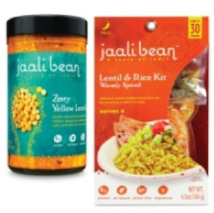
Jaali Bean plans to take fresh market stores by storm with its Indian-inspired packaged foods, with plans to expand its line in local and national chains. The heart of the brand revolves around accessibility and comfort, with ready-to-eat meals and make-at-home kits designed for busy home cooks.
Packaging designed by Kaleidoscope (www.thinkkaleidoscope.com) presents an inviting design influenced by “Indian culture in a sophisticated, yet playful way,” Colin Shanks, marketing and sales coordinator for Kaleidoscope, which designed the packages, states. Customers are encouraged to discover new flavors in the comfort of their own home with help from the convenient multi-serving jars and die-cut lentil kit packaging. A contemporary color palette rich in texture and modern appeal attracts the curious customer in their journey to discover new flavors.
The health-conscious customer can rest assured—clear and concise graphics on the make-at-home and ready-to-eat packaging indicates Jaali Bean’s high protein, low fat and all natural ingredients. Jaali Bean offers a new and exciting option for the growing number of vegetarian, vegan, and gluten-free dieters, as research from Mintel shows “40% of the population now seeks meat-free options for one or more meals a week.”
The name Jaali Bean is rooted in “the Hindi word jaali. The idea of taking something hard—like preparing a homemade Indian meal and transforming it into something beautiful,” continues Shanks. The ready-to-eat and make-at-home kit package designs evoke a fresh, homemade feel. A signature spoon graphic is featured and conveys a sense of sharing at mealtime. “The emblems and seals have clever and sophisticated details that tie back to the brand to create an ownable pattern,” says Shanks. Indian heritage and the enticement of a culinary journey run throughout and echo the company’s mantra, Accessible India.
One Man’s Trash
Method launches ocean plastic line.
Whole Foods Market stores welcome the world’s first product line with packaging made from ocean plastic. Environmentally conscious cleaning product brand Method, earlier this year, debuted the two-in-one hand and dish soap packaged in bottles made from a blend of plastic recovered from the ocean and post-consumer recycled plastic.
The limited-edition packaging was hand-collected by volunteers from Sustainable Coastlines Hawaii and the Kokua Hawai’i Foundation. Over the past year-and-a-half, Method employees have worked with the local Hawaiian volunteers on the project. Several tons of plastic from the beaches of Hawaii were collected, and a portion of the product’s proceeds will go to these two Hawaiian organizations.
To develop the ocean plastic limited-edition design, Method collaborated with Envision Plastics (www.envisionplastics.com), which recycles post-consumer recycled polyolefin resins, to make the bottles. Ocean plastics are cleaned, blended, then remanufactured into high quality recycled plastic with the same quality as virgin high-density polyethylene (HDPE) plastic.
Method’s two-in-one limited-edition hand and dish soap is available in two fragrances—sea minerals and sweet water. Adam Lowry, co-founder and chief greenskeeper of Method reflects on the ocean plastic project, “By recycling and reusing plastic to make our bottles, we turn off the tap of plastic flowing into our oceans and take the first, most important step towards solving the ocean plastic problem.”
Hands-up for New Design
Cutex seeks premium brand status with new design and formula.
Cutex’s target market of female nail enthusiasts, ages 18 to 54, will spot something different on retail shelves as Cutex launches its redesigned packaging and improved formula. Cutex intends to elevate its brand to premium status while “maintaining a linkage to the brand’s heritage,” says Richard Barkaway, creative director at Berlin Packaging’s Studio One Eleven, and Liam Hawry, director of structural package design. Cutex hired Berlin Packaging’s Studio One Eleven (www.studio111design.com) design to help it appeal to Cutex’s desired market of women concerned about the health of their nails, presentation of nails as well keeping up with current colors, trends and treatments. The agency did a complete brand revitalization for Cutex’s new and improved nail polish remover formulas in 6- and 10-oz. sizes.
The basic silhouette of the bottle stayed the same as it is synonymous with the product. But the agency added a decorative swan-like shape to the face of the bottle. The debossed graphic and the lighter pastel color palette and softer graphics adds femininity to the bottle. Other changes made to differentiate Cutex’s packaging from private-label brands include a reverse-tapered closure, which replaced the standard straight-lined cap to elongate the bottle and evoke an upscale appearance. The height of the HDPE package was also elevated to enable Cutex to stand tall on the retail shelf.


