
Pioneering Vino
See how this redesign stacks up.
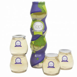
Jaded from consuming wine that would grow stale shortly after popping the cork, Matt Zimmer devised a packing solution worthy of addressing freshness and portability issues. Serving as creator and packaging engineer, Zimmer teamed up with Jodi Wynn and Doug Allan to fashion a 100% recyclable packaging solution that addresses the issue of freshness by offering up four single-serve shatter-poof individually packaged stemless wine glasses.
A zipper runs the length of the shrink sleeve package that rips from top to bottom. Users peel off the shrink sleeve; snap the four individual glasses apart. From there each glass features an individual foil lid, which peels back.
Vertically stacked and the equivalent to one full bottle of wine, Stack Wines launched its revolutionary brand in March of 2012 to the Southern California market. The quality California wine was well received but after nine months on shelf Stack Wines learned that the packaging wasn’t very effective at communicating what the product is. Commune Advertising and Design (www.communeadvertising.com) was brought in to rebrand Stack Wines. “People were drawn to the packaging because it was pretty but they would pick it up and be confused by what it was and they’d move on,” comments Jodi Wynn, Stack Wines co-founder and vice-president of marketing.
Georgianna Allen, creative director and partner at Commune explains the agency’s subtractive approach to all projects as beneficial, “What they needed was nomenclature that quickly told you how to use the product. Zip, Snap, Sip, you get it. You don’t necessarily have to interact with the product to understand the basic convention of use.”
Reverting back to the heritage and tradition of wine, and because of the unconventional vehicle of delivery, new graphics were introduced on the PET shrink sleeve, of wine grapes and leaves in hopes of providing an intuitive visual cue. Lifestyle copy, which describes the best pairing per varietal and venue, follow the Stack Wines mission of making wine completely accessible for any lifestyle.
The single-serve PET Vinoware containers assure durability on the go and adhere to the adopted tagline, “take it with you.”
Hair Care with Heart
Philanthropic efforts inspire design.
Founded in 1989, by husband and wife team John and Lottie Davis, AG Hair boasts high standards for delivering a quality product as well as an equally discerning packaging. Available in 12,000 salons across North America AG is bottled and manufactured in Vancouver. AG is proud of the fact that they don’t use salt to thicken their shampoos, they don’t use paba, parabens, DEA or test on animals, and their philanthropic efforts to build a school per year in Africa, as a portion of the sale of every product goes towards the AG Women Leading Change Foundation.
AG’s commitment to educating women in Sub-saharan Africa influenced the packaging design for their latest product lineup AG Keratin Repair. Aspiring to differentiate the new line of products from the array of AG varieties, while delivering a high-end look and avoiding the creation of custom tooling, to keep expenses down which would directly effect contributions to the Women Leading Change Foundation, AG set forth on a in-house packaging design project with lofty goals.
A jar with in-mold frosting caught brand owner Lottie Davis’ eye, which inspired the Keratin Repair line packaging design. Reflecting on the packaging decision, Kathy Siefke, materials manager, AG Hair says, “The frosting itself brings more of a luxury element to the line. One of the beauties of the line is there are no color additives in the resins so you get this very nice luxurious feel with just using a natural resin. The natural resin both reduces the packaging’s cost and its impact on the environment.”
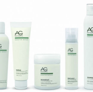
The lineup consists of various packaging materials to house the collection composed of five different hair care products: refuel, shampoo; restore, conditioner; reconstruct, anti-breakage mask; repair serum, anti-breakage sealant; and revamp, volumizing spray.
Achieving a cohesive appearance throughout the Keratin Repair collection was taxing, working with a variety of different resins, stock components and finishes. Maintaining a consistent sage green and dark gray embellishment via use of silk-screen and wet-ink proved challenging as each packaging solution required a different application to achieve the uniformed look.
Mother Knows Best
New car care formula inspires familiar, yet unconventional packaging design.
Mothers, synonymous with California hotrod culture since it’s inception in the 1970s, hopes to establish an innovative product into the car care industry lineup. Mothers approached McLean Design (www.mclean-design.com) to take on the packaging design of their new product offering Leather Tech.
“We’ve said for years that car care is cosmetics for your car, it’s all about beauty,” Ian McLean, founder and creative director, McLean Design says. “We took our inspiration if you will, from skin care. So we made an effort to make this look more modern and advanced than any of the products Mothers had done before.”
The multi-product Leather Tech line features clear PET folding boxes with auto-locking bottoms, which were custom made to house the products. A matte look was achieved by screen printing the outside of the box. The Foaming Wash is housed in a HDPE bottle, wrapped with a laminated pressure-sensitive label. A clear plastic, wide mouth PET jar, wrapped with a clear pressure-sensitive label encompasses the Moisture Infusion Gel Cream packaging. The Moisture Infusion Gel Cream also features a red, resealable lid and yellow foam applicator pad with the likings of Mothers’ face, explains Shane Christman, Mothers’ marketing manager.
Sweet Bliss
Chocolate bar packaging helps elevate brand thus assisting a unique charity.
Chocolate Memories, a charity group founded by Autism Initiatives in 2010 got a golden ticket when they collaborated with Paperjam Design (paperjamdesign.com) via the Business in the Community’s scheme ProHelp, a network of professional firms committed to offering their services pro-bono.
When approaching the design project, Paperjam’s original goals included, “To make an elegant package that showcased the Artisan chocolates beautifully … while also taking the practical implications of those working in the chocolate factory constructing the boxes,” explains Paul Malone, director at Paperjam.
The Art Deco-style packaging carries a typeface reminiscent of the original bar chocolate line. Referencing the original colors and using subtle swirls similar to those in the founding chocolate packaging’s cloud design, Malone states, “We were trying to evoke the emotion of chocolate and chocolate is obviously a dreamy, sort of apparitional food source.”
A Novatech Silk paper was supplied by Antalis Group (www.antalis.co.uk), and the printing and finishing of the packaging was completed by Henderson Print (www.henderson-group.com). Henderson applied varnish and gold foil to the packaging, aiding the appeal of luxury by providing texture with a subtle embossed feel. The UV varnish added during the finishing process reflects light and adds a tactile quality to the Art Deco packaging continuing with the high-end appeal.


